UX Design & Research: Master’s Thesis
Procare Mobile App Redesign
BACKGROUND
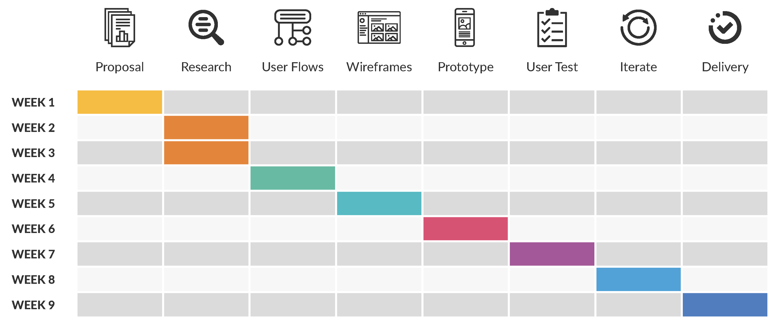
I completed a 15-month Master’s program in UX Design at the Maryland Institute College of Art in December 2020, and this was my thesis project. I developed my thesis independently, and below was my project timeline:
My wife and I have sent our young daughter, Izzy, to daycare since May 2020. It's always difficult being apart from her, especially during the early days of the pandemic; however, we're fortunate that her daycare uses a mobile app, called Procare, for communicating with parents. During work breaks, we read updates on Izzy's day through the app.
Procare is a leading software provider in the child care market, serving over 30,000 preschools, daycare centers, after-school programs, camps, and related facilities across the United States. Its comprehensive suite of products includes child care business management, parent engagement, tuition collection and payment, and staff management, among other services.
For over 30 years, Procare has provided child care businesses with information for making important decisions, maintaining compliance with state and local regulations, and following best practices. Its mission is to reduce the administrative burden on child care centers so they can focus their time and energy on children and families.
While I appreciate Procare and the service it provides, I felt the app could be improved. In the early days of the COVID-19 pandemic, many daycares, including our own, didn't allow parents inside their facilities. Most mornings, we waited in a socially-distanced line of parents as we, one-by-one, dropped our children with staff in the building’s vestibule. After fever checks and the list of COVID-19-related questions were asked and answered, our children were whisked away into their respective classrooms. This process was repeated in reverse during evening pick-ups, so one of our few connections to the daycare – and to our children while they were in their care – was through the Procare app.
PROBLEM
Problem Statement
The problem I attempted to solve with my thesis was to redesign the parent engagement interface of the Procare mobile app used by daycare centers for the purpose of improving its user experience. I intended to strengthen the digital connection between parents, their children, and child care providers by simplifying and amplifying the information shared between parents and providers and by leveraging best practices to resolve existing design issues.
Assumptions
Below were several assumptions I listed after articulating the problem statement:
Users of the Procare mobile app’s parent engagement interface believe it could be improved
With this type of digital solution, users prioritize functionality over aesthetic, though aesthetic certainly impacts functionality
Users feel that improved communication and increased flexibility, efficiency, and control would provide them with a better user experience
Users spend most of their time interacting with a relatively small group of product features and rarely utilize the app’s full functionality
Improvements to the current design could positively impact parents’ perceptions of child care providers, and vice versa
The current layout of the Procare mobile app’s welcome (left) and homepage (right) screens.
APPROACH
I approached the problem by first casting a wide net to help me define reasonable and achievable project parameters. I conducted discovery research by talking with daycare owners, administrators, teachers, and parents who used Procare in order to validate my problem statement and assumptions, while also identifying features and functions of the app that could be improved. Though I had a personal connection to Procare’s parent engagement interface, I felt that I should talk with other users with different perspectives before determining the most prudent approach. I hoped to discover what these varying users found useful about the current app, as well as a wish list of changes that would ideally be made.
Procare’s parent engagement interface has become increasingly important during the COVID-19 pandemic, as many daycares minimize in-person contact to reduce exposure for children and staff. My goal was to strengthen the digital connection between parents and their children as well as parents and daycare administrators and educators. Throughout this process, I intended to uncover best practices and common issues experienced by providers and parents when interfacing with each other through the Procare app. I know first-hand that this connection is difficult to maintain and could be improved by organizing and presenting information in an improved manner and by offering additional features that enhance the experience for parents, while easing the burden for providers.
PROCESS
Brainstorming
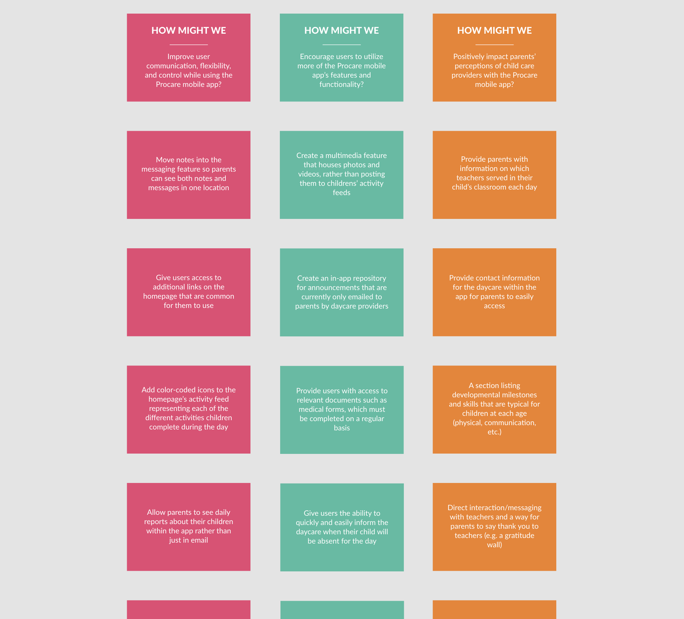
During the brainstorming phase, I navigated through and interacted with every feature, function, and screen in the Procare app, writing down a list of potential questions as they occurred to me. Using these and the assumptions generated earlier, I put together several “How Might We” questions and began ideating, which I’ve included in part below:
A list of some of the “How Might We…” questions and answers generated during the ideation phase.
Research
My research consisted of the following:
Independent heuristic evaluation
User interviews
User survey
Competitive market analysis
I conducted 10 user interviews with daycare center owners, administrators, teachers, and parents (separate from my initial discovery research), with parents constituting the majority of interview subjects. Each interviewee was currently using the Procare mobile app’s parent engagement interface. My 8-question user survey was distributed to parents whose children attended daycare and who ranged in age from 10 months to 5 years old. I received 42 responses, with all respondents being current users of the Procare app’s parent interface. After finishing this portion of my research, I synthesized the resulting information to create the following user persona:
My competitive market analysis primarily focused on four other key players in the child care software industry. Similar to Procare, each company offered comprehensive child care platforms for business management, parent engagement, billing, and staff management. These competitors – listed below – were well-known in the industry and offered reputable services.
Target Audience
My primary target audience was parents who used the Procare mobile app’s parent engagement interface, along with child care providers such as teachers and administrators. During my discovery research, the owner of my daughter’s daycare described Procare’s vast software ecosystem and how many different functions it served. They had recently signed a contract with Procare after years of using a different child care software, which he felt was far more limited. The description of his Procare user experience was so overwhelmingly positive that I was beginning to wonder if I had chosen the right project. However, as we continued to talk it became clear that his positive reviews were primarily based on Procare’s administrative interface. When I posed additional questions about the parent interface, he admitted that it seemed Procare had focused on the administrative side of its platform to the detriment of the parent-facing side. That moment affirmed for me that Procare’s parent engagement interface would be the focus of my project and the target audience would, in order of priority, be: Parents, teachers, and administrators.
Concept Evolution
From my research, I learned that direct messaging and multimedia were two of the most common features that parents felt could be improved in the Procare app. As a result, I initially considered the concept of designing a new homepage that served as a hub for more easily navigating to such features. This would replace the existing homepage, which was simply the activity feed for each child, listing their daily activities in a live-updated format. Additional features were accessible from the homepage in its current structure, but were designed to be much less prominent. However, feedback from my user interviews and survey suggested that the activity feed was the first screen many parents preferred to see when they opened the app, so I decided to preserve that design element.
The concept I ultimately chose was shaped by the following key findings, which were generated by my research:
Consolidated Messaging
User research indicated that messages and notes should be consolidated in one location to assist parents with information management. Currently, notes are posted to a child’s activity feed and not included within the existing messaging feature.
Visual Design
The Procare app is well-designed and minimalistic, but could be improved in targeted areas. For example, the homepage, which lists a child’s daily activity, could include color-coded icons for activities in order to facilitate information absorption and retention.
Multimedia Accessibility
Parents expressed a unanimous desire for photos and videos to be housed in a multimedia-specific location rather than being posted to their child’s activity feed. This would facilitate multimedia retrieval and simplify the sharing process.
Parent-Teacher Connection
Parents felt their digital connection with teachers was tenuous, which has been amplified by COVID-19. It’s unclear which teachers are present in their children’s classrooms each day, and there’s no digital avenue for parents to directly communicate with teachers.
Absence Auto-Notice
A feature that both parents and providers stated would be helpful was an automated option for parents to inform providers that their child would be absent. This would simplify a process that currently requires parents to call providers or write an email or in-app note.
Information Hub
Research suggested an in-app repository for parents to access relevant information and documentation would be useful. Currently, important announcements and documents such as medical forms are not accessible to parents within the Procare app.
Visual Design
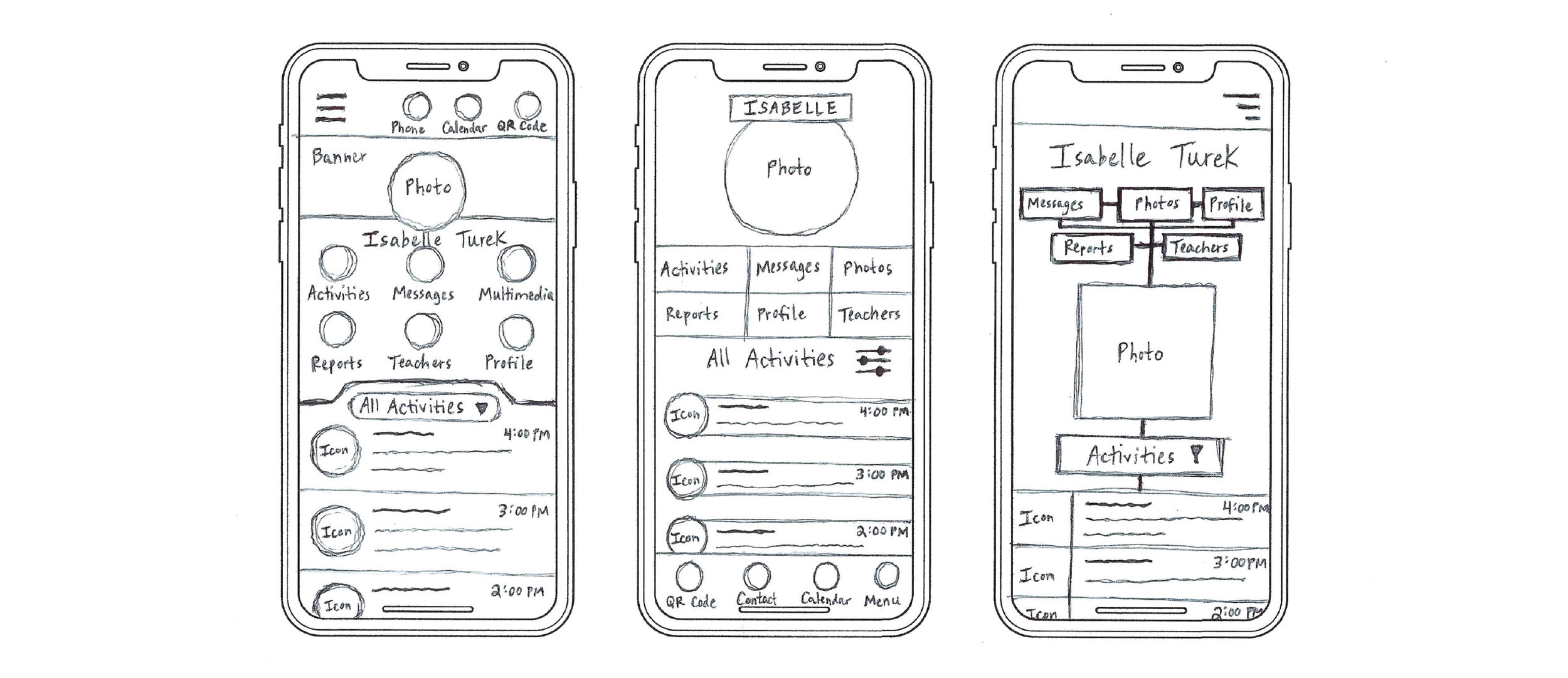
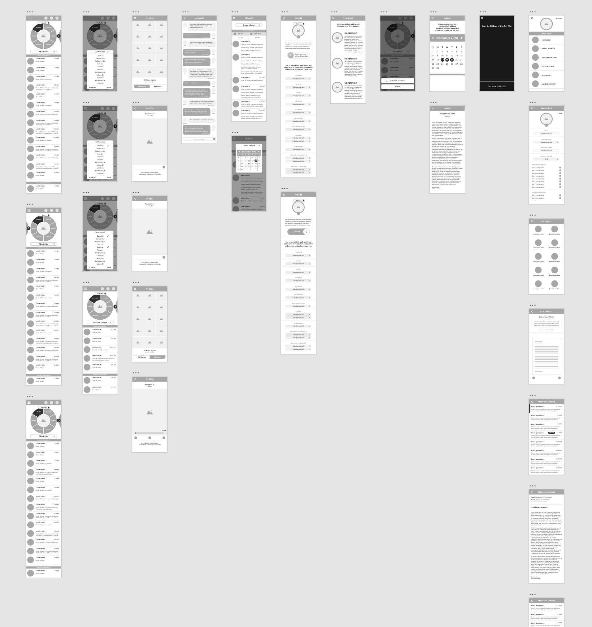
I created user flows, design sketches, and wireframes prior to prototyping. My sketches were rudimentary and primarily explored how to design an effective homepage, as that particular screen was the most complex and was where parents spent the bulk of their time while using the Procare app.
From my research, I determined that each child’s photo and activity feed should be displayed on the homepage similar to the current layout, but with six associated quick links: Activities, Photos, Messages, Reports, Profile, and Teachers. This would allow parents to efficiently access important information regarding their child or children. Given the narrower width of mobile screens, there wasn’t sufficient space for a horizontal list of all six links. Likewise, a vertical list of links would have cut into the information displayed in the activity feed, which was a highly-valued component of the homepage according to the parents I interviewed. Therefore, I arrived at a circle / wheel design to house the six quick links, which was somewhat unique for a mobile app. However, it was compact enough to fit horizontally and didn’t take up an unreasonable amount of vertical space by pushing the activity feed too far down the screen.
As for other commonly-used links such as the Contact, Calendar, and QR Code links, I contemplated housing them entirely within the hamburger menu both on the top and bottom of the screen. I ultimately decided against consolidating them in the menu because the links – particularly the QR Code for parents to sign their children in and out of daycare – were accessed often enough to frustrate users if they were more than one click away. Additionally, I decided not to place the navigation menu at the bottom of the screen due to the nature of the activity feed (i.e. it is formatted as one long scrolling screen), which could have led users to accidentally select the associated links if they were located below the feed.
For other visual design choices, I applied Procare’s color palette and favored creating linked pages / screens that could be closed in order to quickly return to the homepage and its activity feed. One of my goals was to incentivize parents to engage with more of the app’s features and functions, so I attempted to house a broader range of relevant information within the app than was currently available, such as their child’s profile, teachers, daily reports, documents, and announcements.
Some of the design ideas I sketched on paper prior to creating my prototype.
The wireframes I created prior to developing my prototype.
Development
I used Adobe XD to create my prototype of the redesigned Procare mobile app. A link to the prototype can be accessed by clicking the smartphone screen below:
OUTCOME
Challenges
One of my more immediate challenges was determining the appropriate project scope. Many of the assignments we’ve undertaken during our program have been with groups, so setting reasonable and achievable goals for an independent project requiring multiple deliverables was an important question to answer early on.
Another challenge was that daycares operate in a highly-regulated environment that leaves less room for flexibility. At times, the application of industry rules and guidelines can also be ambiguous, causing confusion as to which ideas might be permissible. This occasionally made it difficult to determine which elements could legally be included in the Procare app redesign, such as live-video feeds of children’s classrooms or other video communication tools that could enhance the connection between parents and providers.
In addition, it was initially challenging to convince daycare administrators to distribute my user survey and connect me with parents and staff for user interviews. They were reluctant because of both privacy concerns and the risk of overwhelming parents and staff during an already stressful time. I offered to let them pre-approve my user questions and said I would share any useful insights I gathered from my research, which could potentially be passed along to Procare if it might lead to useful app improvements. I also explained that, from a parent’s perspective, the app served as a bridge between parents and providers now more than ever before.
Implementing design ideas that enhanced the digital connection between parents and daycare providers, but didn’t overburden teachers, was also a challenge. The app, in its current form, already required teachers to collect and report information to administrators and parents about the children in their care, and asking more of teachers risked negatively impacting their job performance. From my research, I learned that teachers already felt over-stretched and that COVID-19-related staff shortages often left them with heavier workloads, so I had to carefully select design ideas that helped rather than hindered them.
The final challenge was that I felt the Procare app was already well-designed. It was minimalistic and certainly had room for improvement, but overall it was one of the most successful mobile apps in the child care management industry.
Reflection
I learned a great deal during and after my work on this project. For me, the best part of the experience was independently tackling each of the steps in the UX design process from proposal to delivery. As I mentioned earlier, many of our previous projects in this program have been with groups, and this was one of the only times we were able to design (or in my case, redesign) a product from beginning to end on our own. In group projects, it was easy to become pigeon-holed in a particular role for having served in it previously, so having a chance to work on each piece of the puzzle first-hand was a welcome challenge.
Another lesson I learned from this project was an appreciation for the complexity of designing a child care platform’s parent engagement interface. As a user, it’s easy to critique a digital product, but attempting to design something better made me respect the Procare app more than I originally had. Throughout the project, I constantly ran across design subtleties that had previously escaped my notice, which helped me more fully understand the work that went into creating the current app.
Finally, a seemingly unremarkable learning experience involved accepting that small, incremental improvements were still meaningful despite the fact that I originally set out to make more sweeping changes. Updates such as consolidating messages into the existing messaging feature or creating a feature that housed multimedia weren’t revolutionary, but research revealed they were important to users, especially parents. Many of the changes suggested by my redesign involved recognizing and maintaining what worked in the current app, but refining to make them even better.
And if I had the opportunity to continue working on this project, my next steps would have included the following:
Video Communication
Parents stated it would be useful for the app to offer a video communication option considering in-person communication with teachers and administrators has been limited during COVID-19. They believed this would strengthen the parent-provider connection.
Developmental Milestones
Research suggested parents were curious about their children’s development and the milestones they had achieved or were approaching. Some wished to be better informed of the timing of certain milestones as well as their children’s progress towards them.
ECA Registration
Some parents expressed a desire for the app to better facilitate participation in extracurricular activities (ECA) such as field trips, sports, etc. This could be accomplished by providing notifications and enabling registration for ECAs through the app.
View Transactions
The “View Transactions” screen – accessible within the menu – displays family daycare payments in such a way that renders them nearly unreadable. It also provides a balance due alongside a “Make Payment” link, which is confusing for parents whose daycares don’t accept online payments through Procare.


